Why Raf Simons Could Actually Reinvent Calvin Klein
Raf Simons made his Calvin Klein debut last week. Against an abstract set by longtime collaborator Sterling Ruby, Simons revealed his vision for the iconic brand. His collection was uniquely all-American. It featured bright hues, bold silhouettes, and a bit of that classic Calvin Klein sex appeal.
The NYFW catwalk marks the last phase in a series of company changes for Calvin Klein. First came the introduction of Calvin Klein by Appointment, a concept whereby anyone could take advantage of the brand’s famous New York studios. Next was Simons first ad campaign for his new Calvin Klein collection.
The new ad was unveiled the same week graphic designer Peter Saville tweaked the company’s logo. Saville replaced the iconic Avant-Garde-esque lowercase lettering with an entirely uppercase version. Then, new logo and aesthetic intact, the company officially launched Simons as their new head designer.To give you confidence amidst all this upheaval, here are some triumphant moments from Raf Simons illustrious fashion past.To give you confidence amidst all this upheaval, here are some triumphant moments from Raf Simons illustrious fashion past.
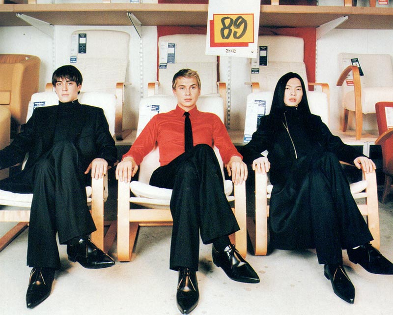
THE SKINNY SUIT
Raf Simons basically defined menswear fashion in the early 2000s. Originally an industrial designer, he entered the fashion world with his own show in 1995. He hit the ground running. While fashion giants like Tom Ford were making Studio 54 lotharios, Simons came out with the slim suit and relentless youth of the electronic and punk music scenes. It was he who tried out energetic colors with formal trousers and ties, referencing not only punk but bands as far back as Kraftwerk and even the Beatles.
It could be argued that Simons owes some of the credit for his slim suit revolution to Helmut Lang, but the brightly-colored youthfulness was all his. His dynamic debut proved his ability to take a unique idea and run with it, even if it went against dominant industry trends. It also proved foresight. Simons memorable 1998 runway boasting the Kraftwerk-inspired red shirts and black ties predated turn-of-the-millennium “Electroclash” by two years. What started as a rebellious catwalk outfit in 1998 was the staple look of hipster culture by the summer of 2000.
WOE ONTO THOSE WHO SPIT ON THE FEAR GENERATION…
Simons work in the early 90s was innovative and even rebellious, but it was not controversial. In 2001, the artist launched the most influential show of his career. Awkwardly titled “Woe Onto Those Who Spit on the Fear Generation… The Wind Will Blow It Back,” the show was a watershed moment in political fashion, controversial clothing trends, and Raf Simons fashion career. The designer drew his inspiration from freedom fighters, instructing his models to mask their faces and walk barefoot.
They were dressed in torn and shredded hoodies printed with startlingly shocking slogans. In many ways, Simons June 2001 show was the main precursor to the politically motivated shows we’re seeing at this year’s NYFW. In 2001, the show was sharply criticized. The Times called it a “terrorist-inflected collection.” Directly after the show, Simons feared it had been so badly received it would cost him his career. Luckily, that wasn’t true. Now, the show is widely remembered as one of his finest.
SIMONS AND SAVILLE
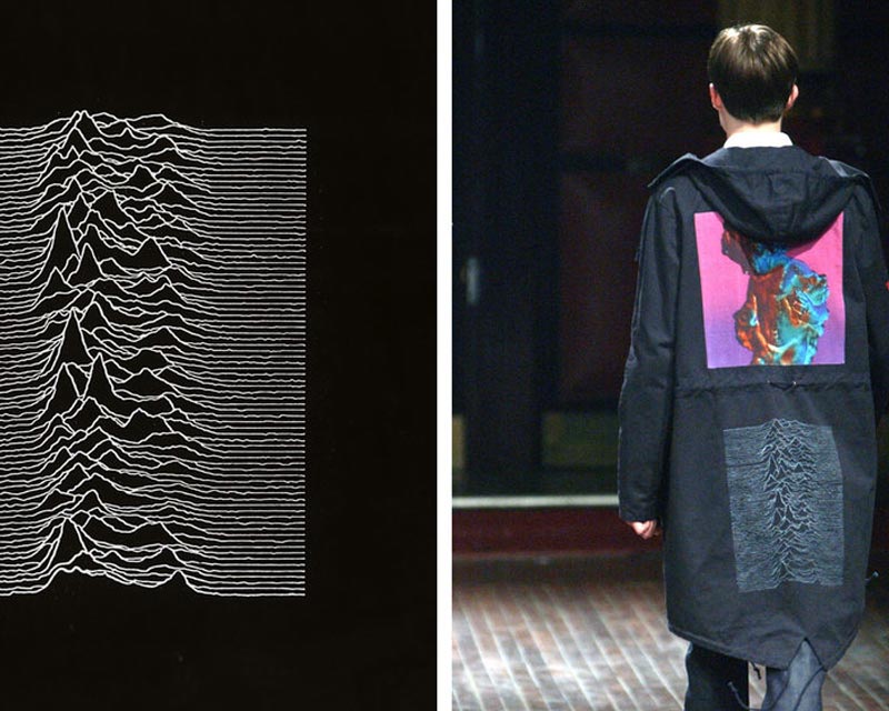
Peter Saville and Raf Simons met long before they united to re-invent Calvin Klein. The two first worked together in 2003. Simons was an avid fan of Saville’s work with Factory Records, particularly the album covers for bands Joy Division and New Order. He wanted to incorporate those graphics into a fashion line. For his “Closer” show, Simons took all he could from Saville’s extensive Factory Records archive. What he devised was unlike anything done before. One such iconic example was his fishtail jacket based on Joy Division’s “Unknown Pleasures” album. To Simons’s eye, the jagged radio-waves graphic could be simply repurposed with a needle and thread. Though the duo’s first partnership was innovative, it was also too expensive to be very accessible. The Calvin Klein logo is a far more marketable use of these artists’ joint talents.

COLORFUL PALETTES
In 2011 and 2012, Simons took a romp into more colorful territory. It started on his spring/summer runway for Jil Sanders. Every outfit was made out in brilliant techno-couture, colors like hazmat orange and highlighter pink on airy synthetic fabrics. The designer played with volume too, adopting billowing sack-back gowns and puffy peplum skirts from Christian Dior’s midcentury runways. Simons playful experiment prompted an entire generation to ditch black in favor of fluorescent-hued femininity.
This burst of color came near the end of Simons’ career with the Jil Sander brand. The very next year, he became the artistic director of Christian Dior. At Dior, Simons immediately became the subject of the documentary feature “Dior and I,” launching his first collection in just 8 short weeks.
When the show opened, it was clear he had brought his love of colorful haute couture with him. The outfits were gorgeous, but it was the set that got the raving reviews. It was made from a sequence of salons wrapped wall to wall with delphiniums, orchids, mimosas, and roses. It was the perfect backdrop for the collection, a rediscovery of the full, petal-like “la femme fleur” skirts of 1947. In 2012, Raf Simons had all the flower power.
With such iconic moments under his belt, there is little question Raf Simons has the skill to make Calvin Klein’s upcoming years meaningful and fashion blog-worthy. Friday morning was no “Woe Onto Those Who Spit on the Fear Generation… The Wind Will Blow It Back,” but it showcased some compelling, original ideas. Keep an eye on Calvin Klein. You don’t want to miss Simons’ next big moment.
More from Richard